Colours

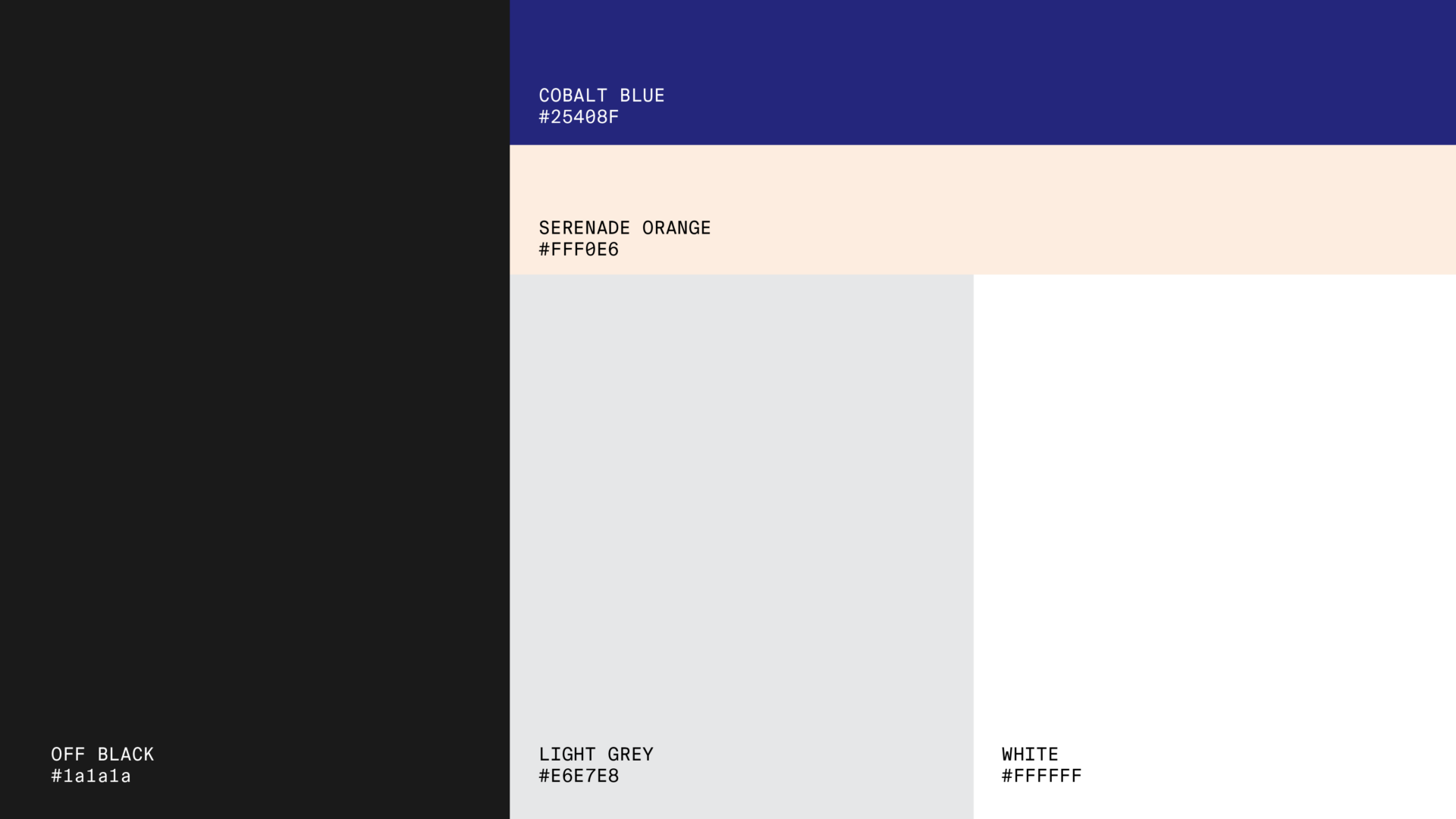
Orama’s Color Guidelines introduce a distinct palette of primary and secondary colors that convey the brand’s minimalist style. Each color—such as off-black, light gray, cobalt blue, and serenade orange—is detailed with codes and percentages for digital, print, and industrial use to ensure visual consistency. Additionally, examples of effective color combinations and textures offer guidance on creating cohesive brand visuals across media.

Primary
OFF Black: Typography graphic elements. LIGHT Grey: Large paper / screen areas
Color name
Screen
Print
OFF BLACK
RGB: 26,26,26
HEX: #1a1a1a
CMYK: 0/0/0/90
PANTONE:
LIGHT GREY
RGB: 230,231,232
HEX: #E6E7E8
CMYK: 8/6/6/0
PANTONE:
Secondary
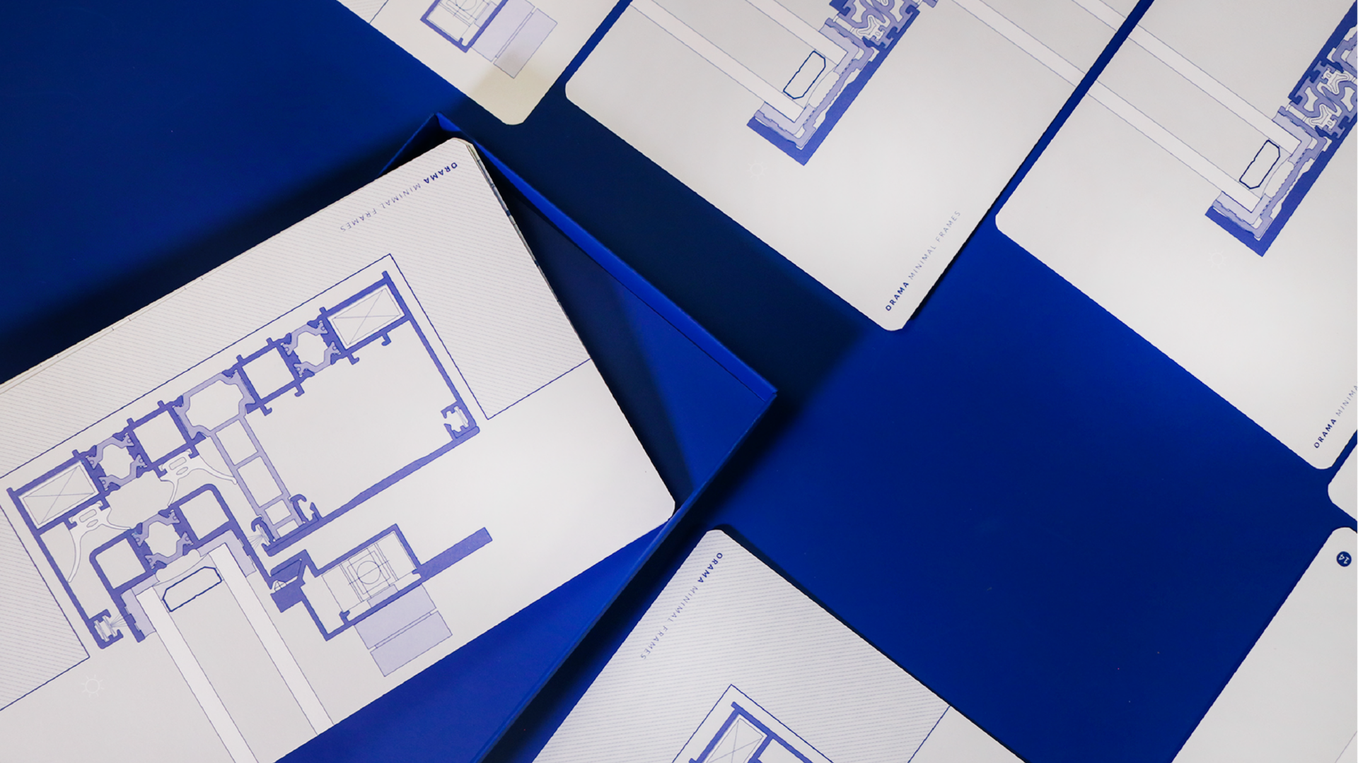
COBALT BLUE: Technical Drawings, large paper/screen areas, products and promo material. SERENADE ORANGE: Large paper / screen areas
Color name
Screen
Print
COBALT BLUE
RGB: 37,64,143
HEX: #25408F
CMYK: 99/89/10/1
PANTONE:
SERENADE ORANGE
RGB: 255,240,230
HEX: #FFF0E6
CMYK: 0/6/7/0
PANTONE:
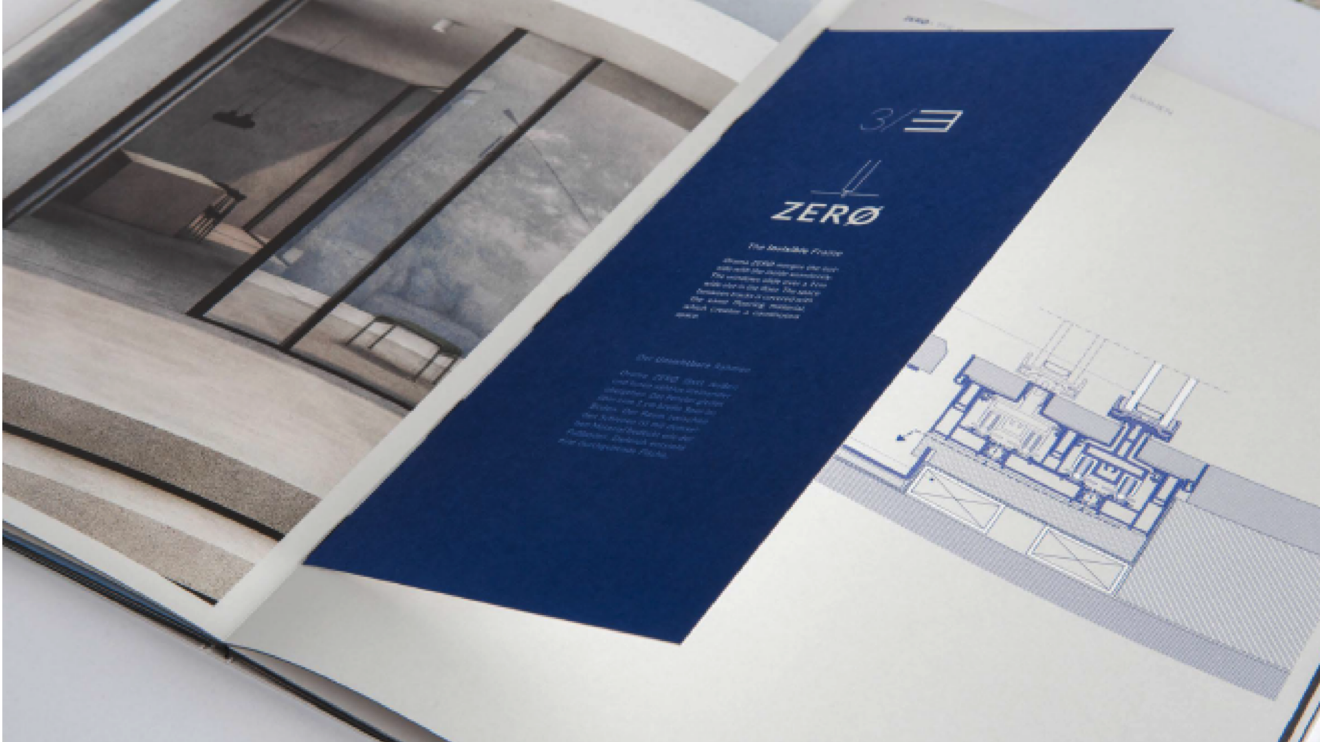
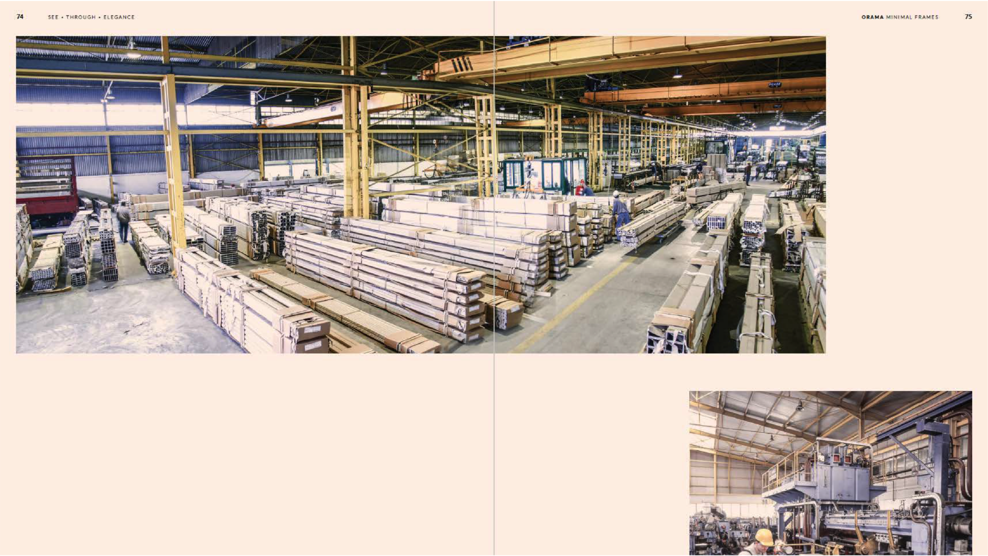
Palette combinations - Examples

Use colors strategically to create a visual hierarchy in your communications.
Textures

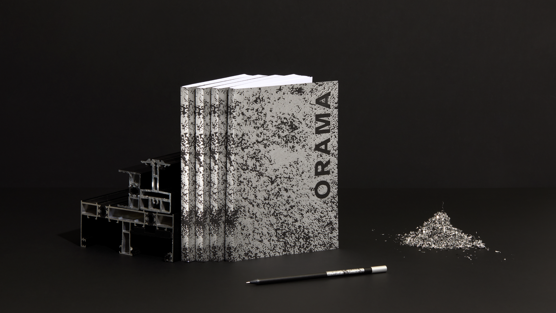
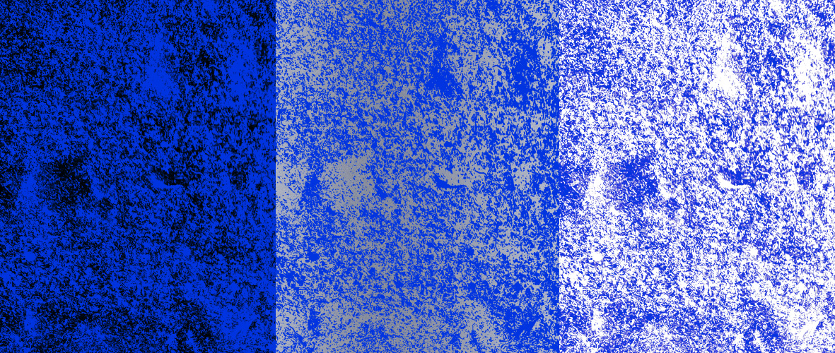
The texture used in Orama’s branding is derived from aluminum shavings, transformed into a distinctive pattern applied as foil and across various applications. It conveys a raw, organic quality while reflecting an industrial yet refined aesthetic that reinforces the brand’s deep connection to its core material.
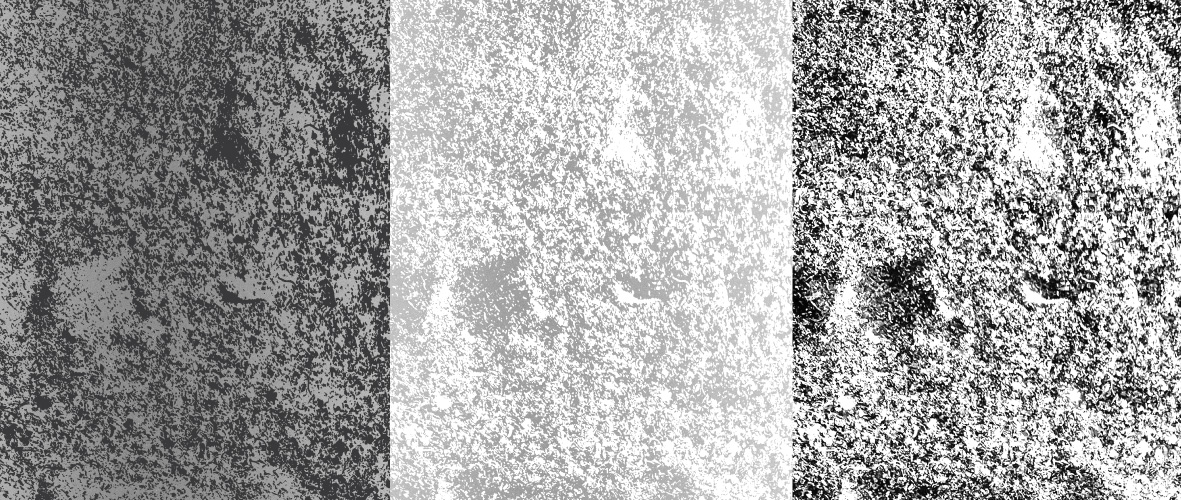
Black & White Texture
Color Texture
Texture combinations - Examples

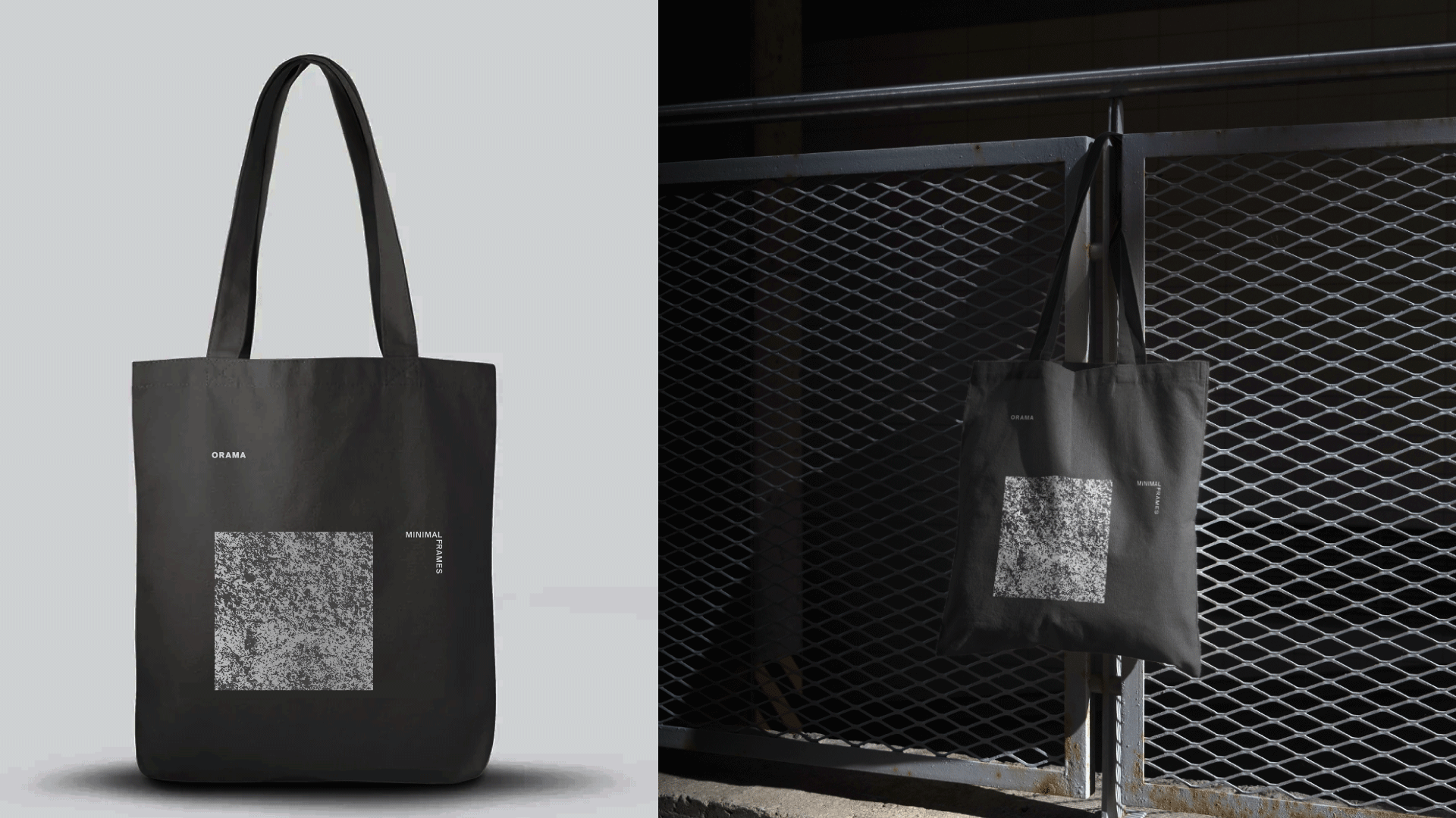
The texture combinations can enhance backgrounds, packaging, or digital spaces, adding depth and a tactile quality that aligns with Orama’s identity.