Logo variations are rearranged versions of Orama’s primary logo design that gives us the flexibility to use consistently different versions of the logo in different placements depending on the format.
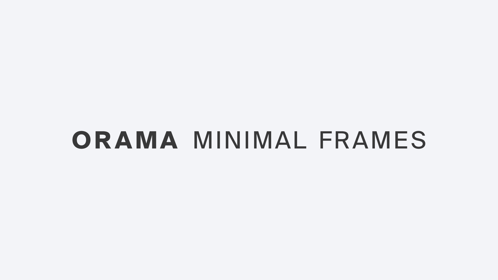
Horizontally aligned version of the logo is our primary logo, ensuring clarity and legibility in wide-format applications. This version is ideal for banners, website headers, and printed materials where a streamlined and balanced look is preferred.
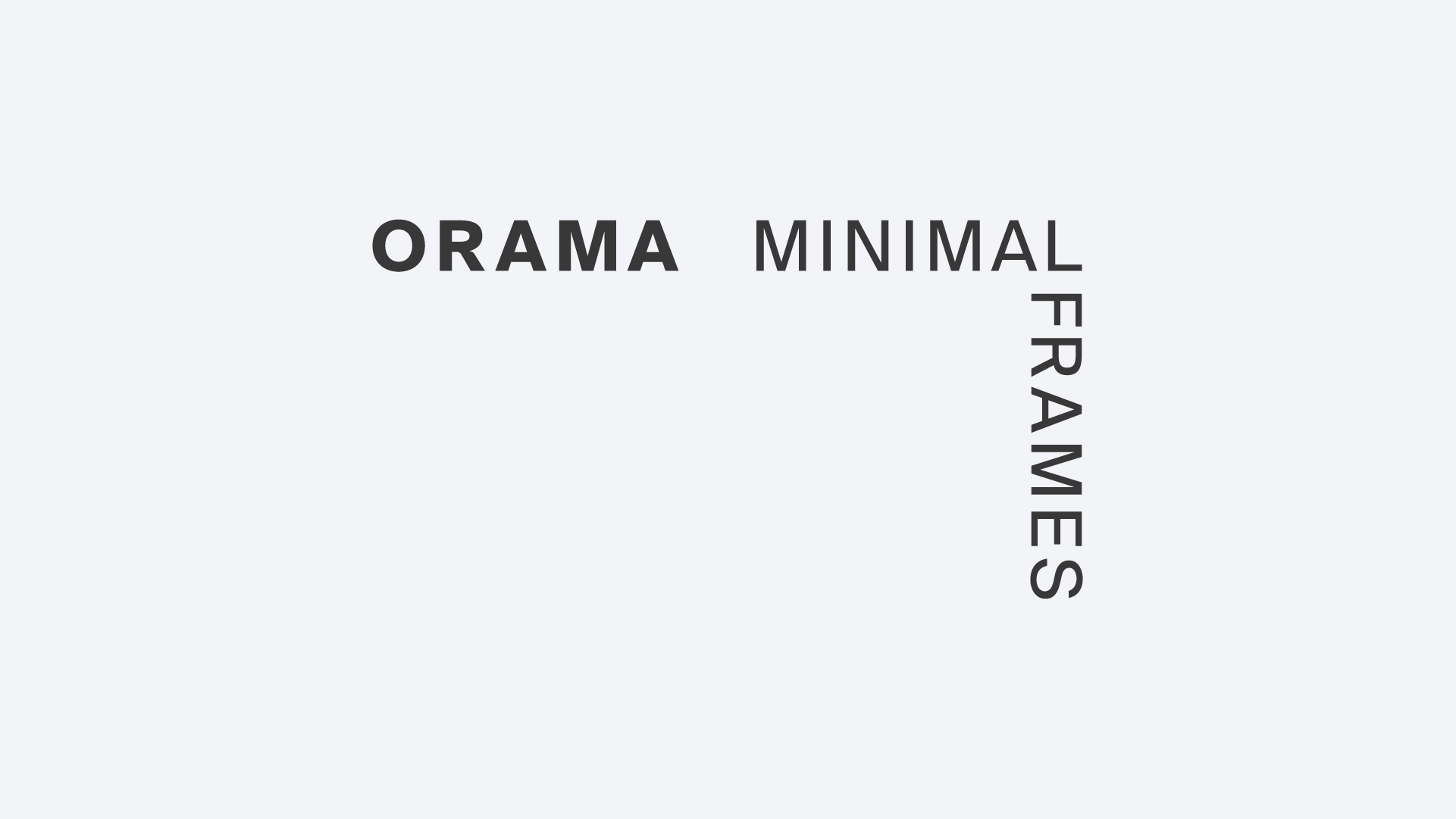
A compact version of the logo, with text arranged in a corner layout. Best suited for square or confined spaces, such as packaging, social media assets, or promotional materials.
A reduced version of the logo that focuses solely on the brand name, without additional elements. Designed for compact applications such as favicons, watermarks, and brand stamps. This version must never be used in official representations of the brand.
Our icon is a shorter version of our logo. Use the icon on its own
A simplified version of the brand symbol, optimized for clear display at small sizes across web browsers and tabs.
Represents the core identity with a simplified symbol. Can be used for social media profile etc..
Our logo system is designed to adapt with ease, allowing flexible and fluid use across both print and digital media. It lives within generous white space and finds balance when centered or placed in the corners, framing each composition much like our minimal frames. This approach ensures clarity, elegance, and a consistent sense of identity across all applications.
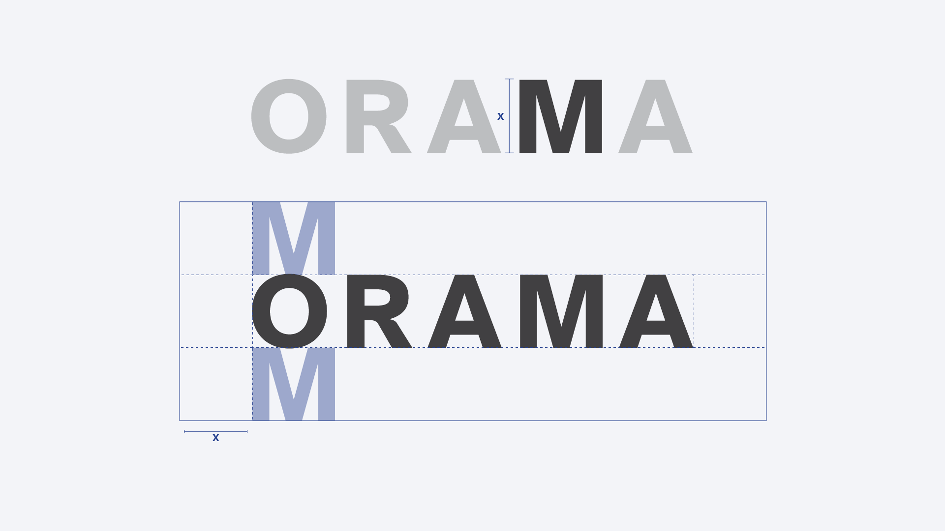
When using the logo in a design or placing it next to other visual elements, you should ensure that it has plenty of room to breathe. This is where clear space and margins come in to play. The logo’s clear space defines the distance between the logo and any graphic element it may be sitting next to in a composition.
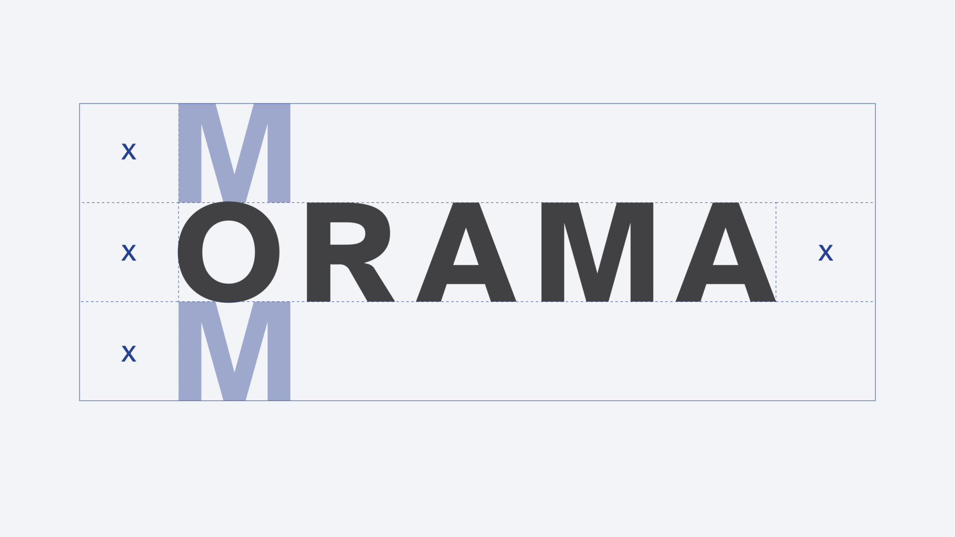
The size of the exclusion zone is based on the height of the “M” in our logo. Apply the boundary using the x-height, or starting from the top left corner of the “O”.
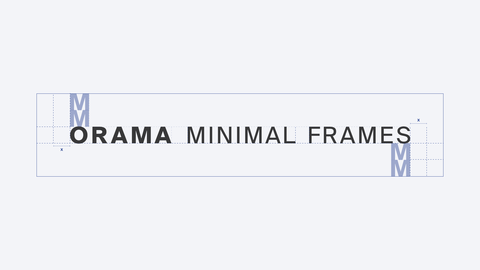
The size of the exclusion zone is based on the height of the “M x 2” in our logo. Apply the boundary using the x-height, or starting from the top left corner of the “O”.
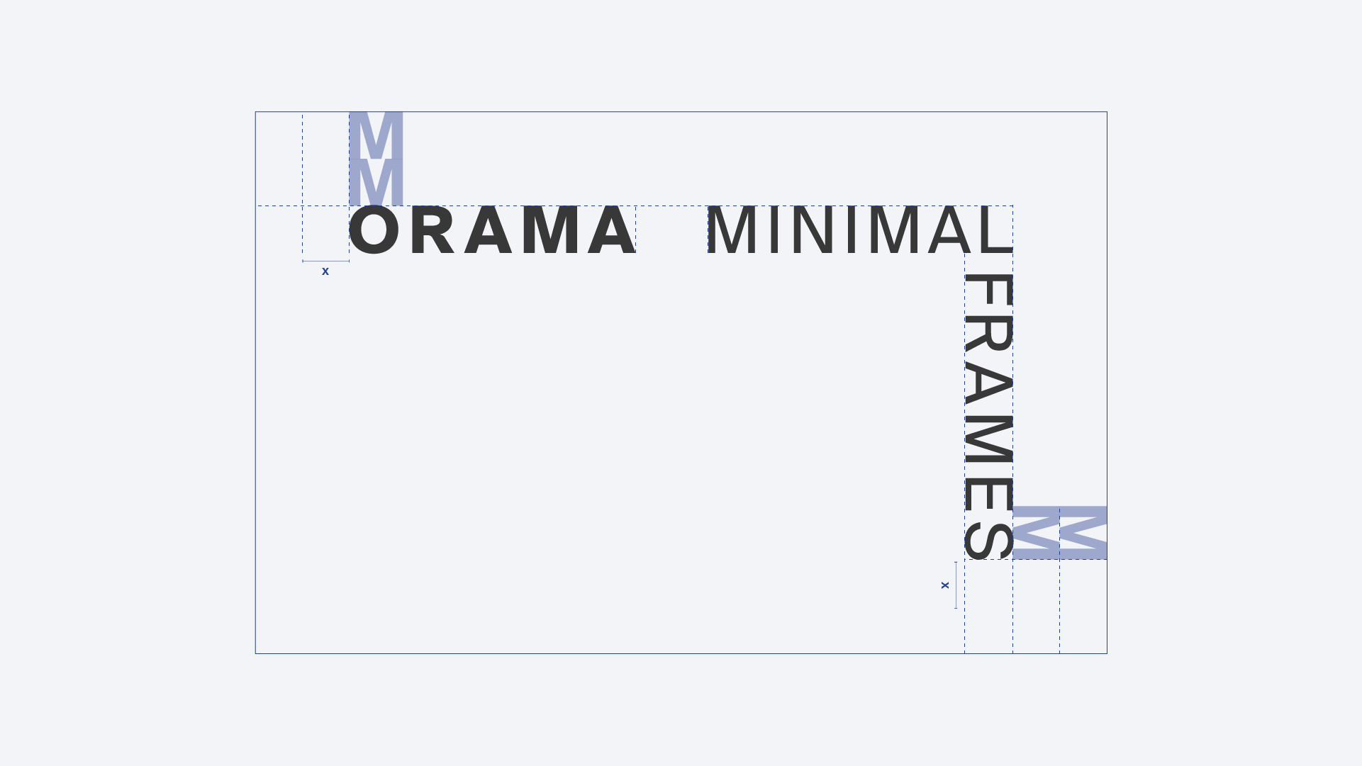
The size of the exclusion zone is based on the height of the “M x 2” in our logo. Apply the boundary using the x-height, or starting from the top left corner of the “O”.
To ensure the legibility of Orama’s branding, never use the mark and primary logotype, at sizes smaller than the minimum size requirements. The symmetry of the mark and the primary logotype should never be altered. Please make sure to maintain the correct proportions when scaling.

Logo Mark
Print application minimum size
25mm width
Digital application minimum size
50px width
Logo Linear
Print application minimum size
25mm width
Digital application minimum size
50px width
Includes logos variants for dark, light, and monochrome backgrounds.

The logos are mainly used only in black or white, the primary colours
of the ORAMA brand. Always make sure that there is
enough contrast between the logo and the background.
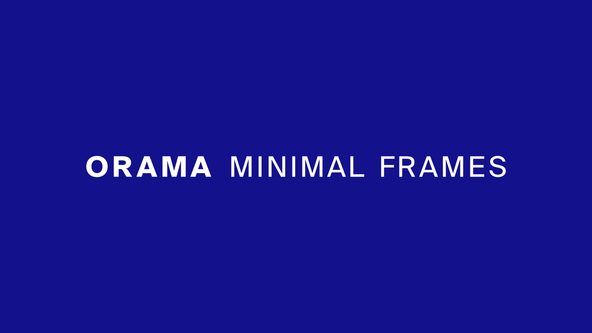
White logo on the core palette background colors
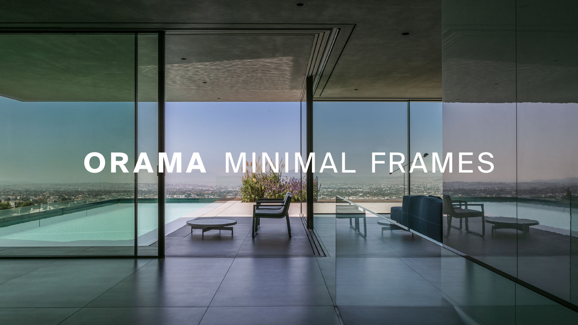
White logo on a photo background.
ORAMA logo in the core palette colors
